leo pizzo

jewelry display

leo pizzo

jewelry display

Can we design a beautiful stage that echoes the brands identity?

Can we design a beautiful stage that echoes the brands identity?

Leo Pizzo required a re-design of their jewelry displays to provide them with a more modern & elegant appearance.

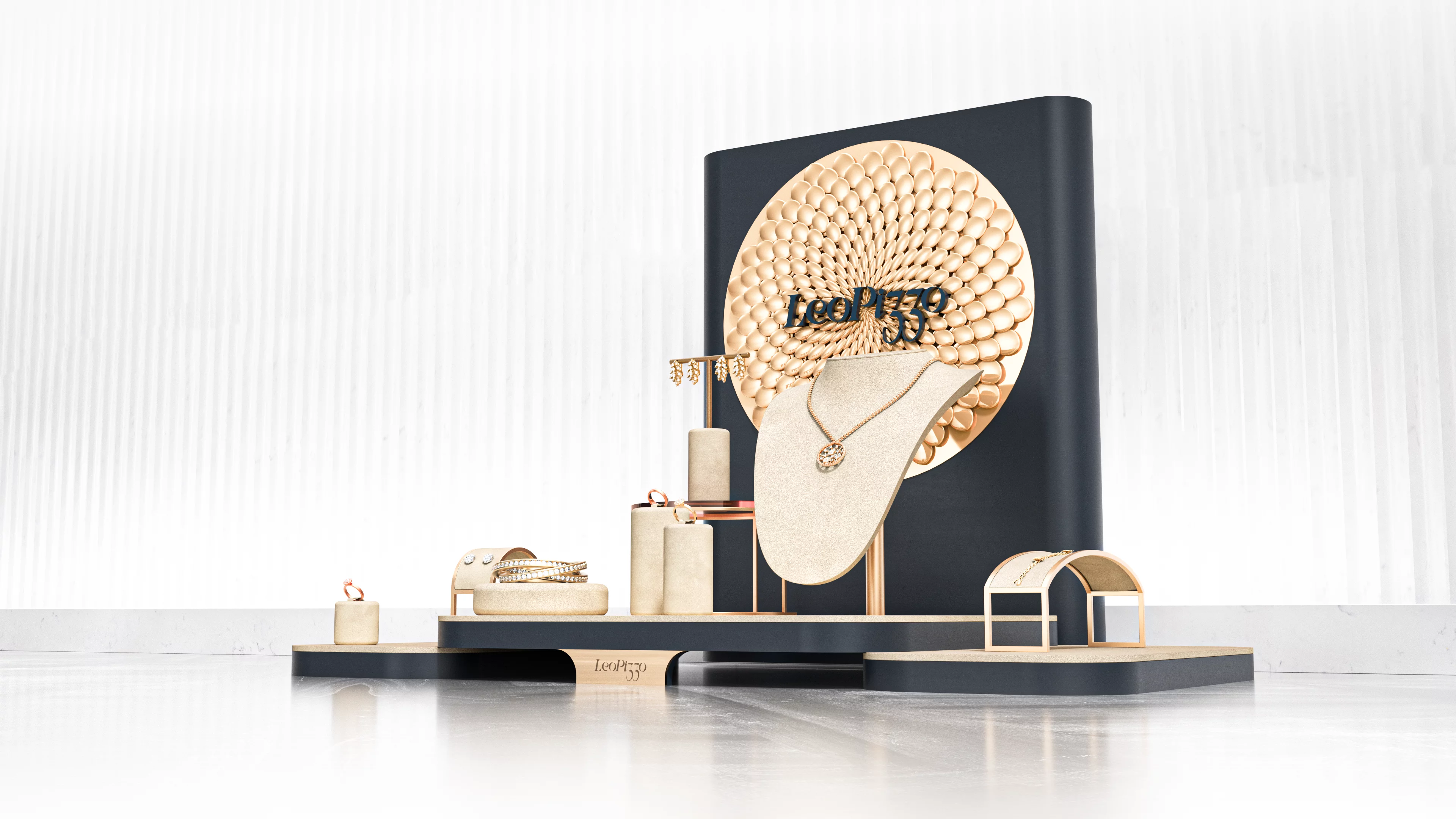
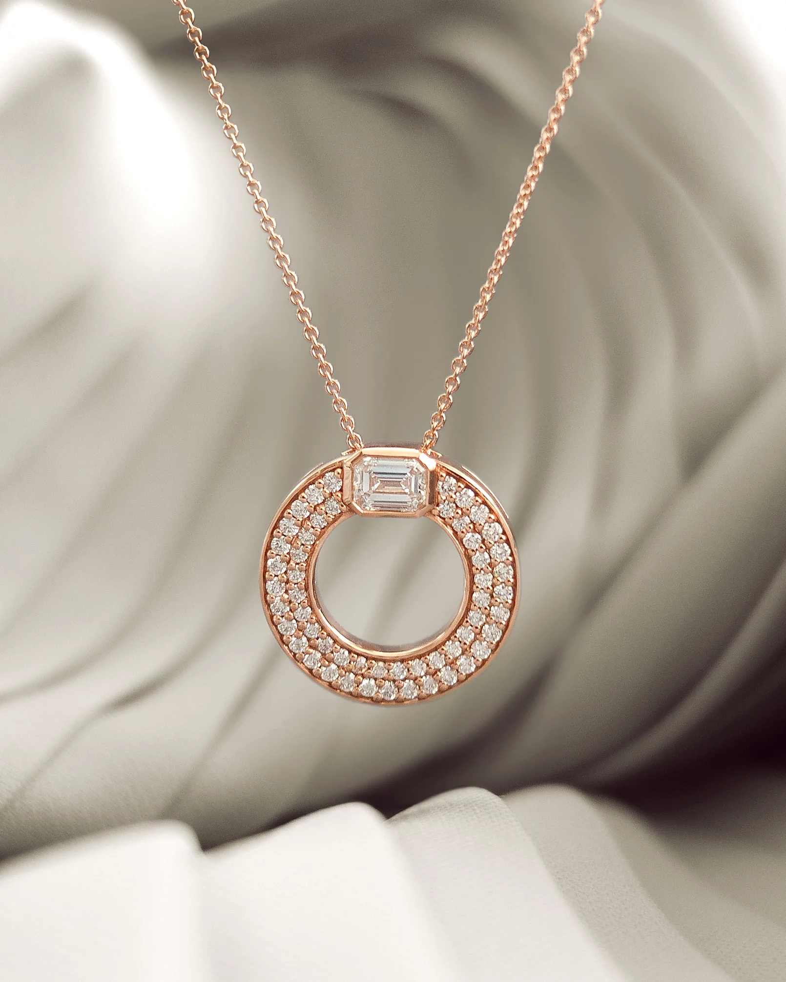
The brands outstanding high-end jewelry draws inspiration from nature and communicates a weightless elegance, as if perfectly captured in a moment of motion.

I applied these attributes to two designs that fuse together the different facets of the brand in one cohesive stage.

Previous stands & busts.

Design 1

The design mixes beige suede with navy veneered MDF, creating a strong contrast between jewelry presentation and its backing. A round 3D metal motif resembling flower pollen is situated on the back wall, highlighting an applied Leo Pizzo logo in front of it. The stands feature a mix between pure velour and brass metal frames. Being held up by a metal shaft, the bust appears to float to the viewer.

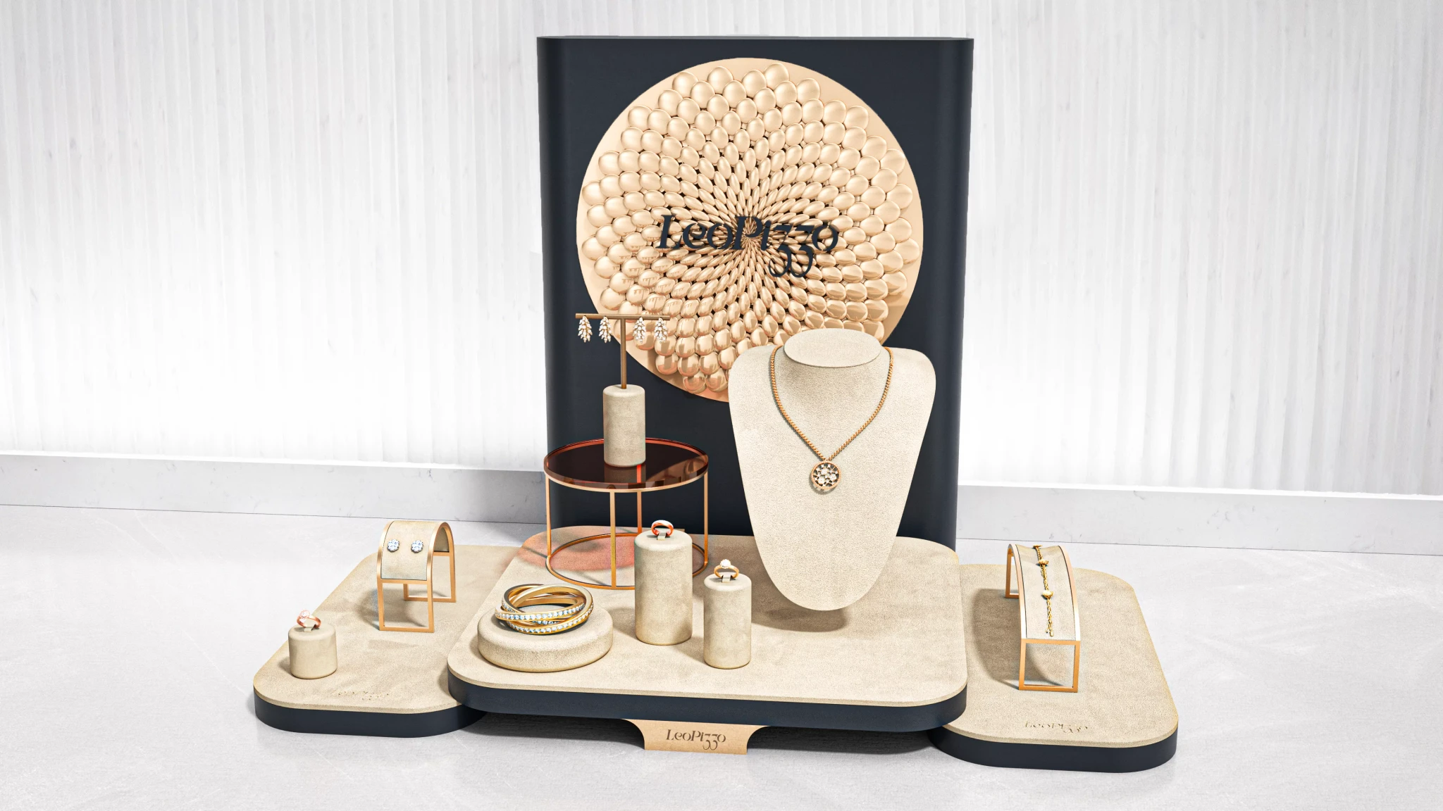
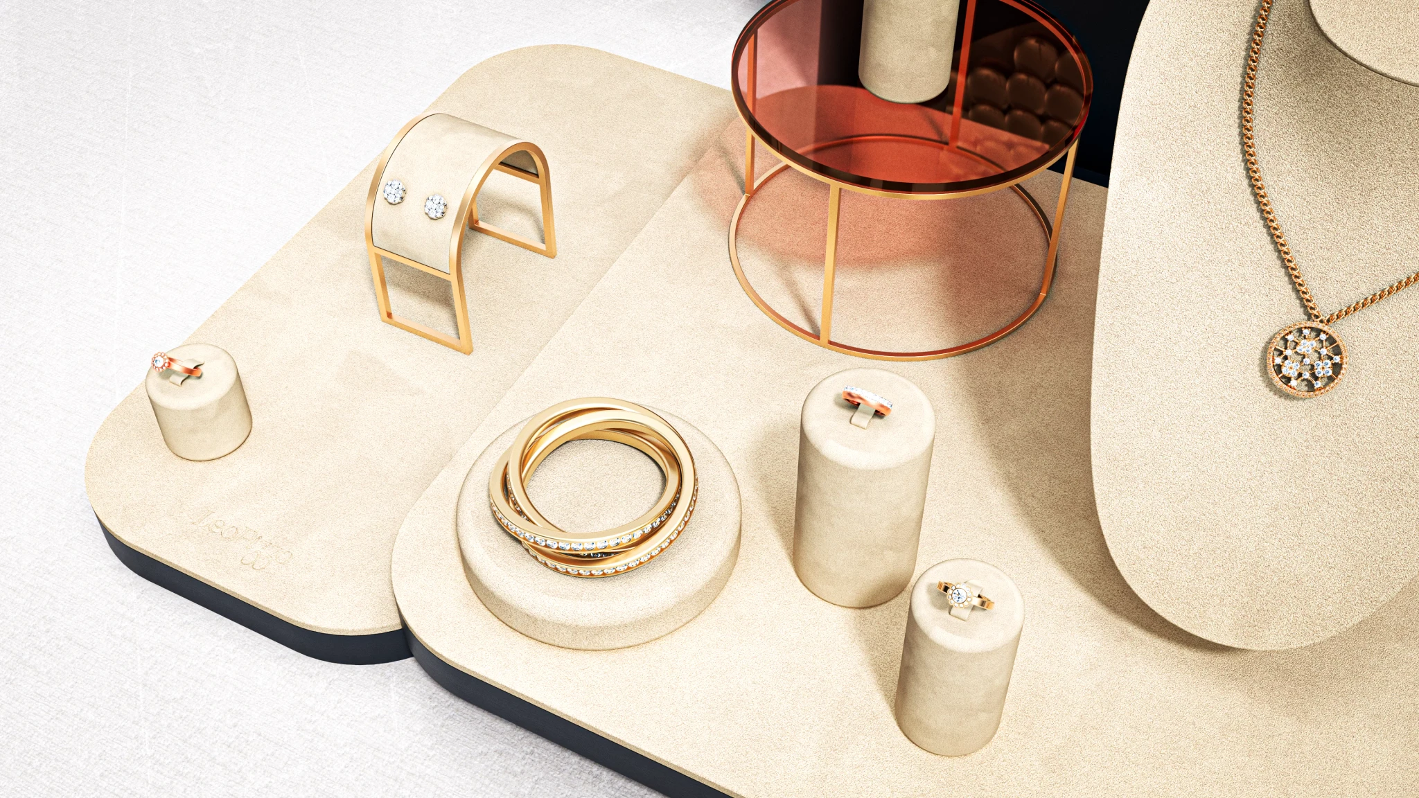
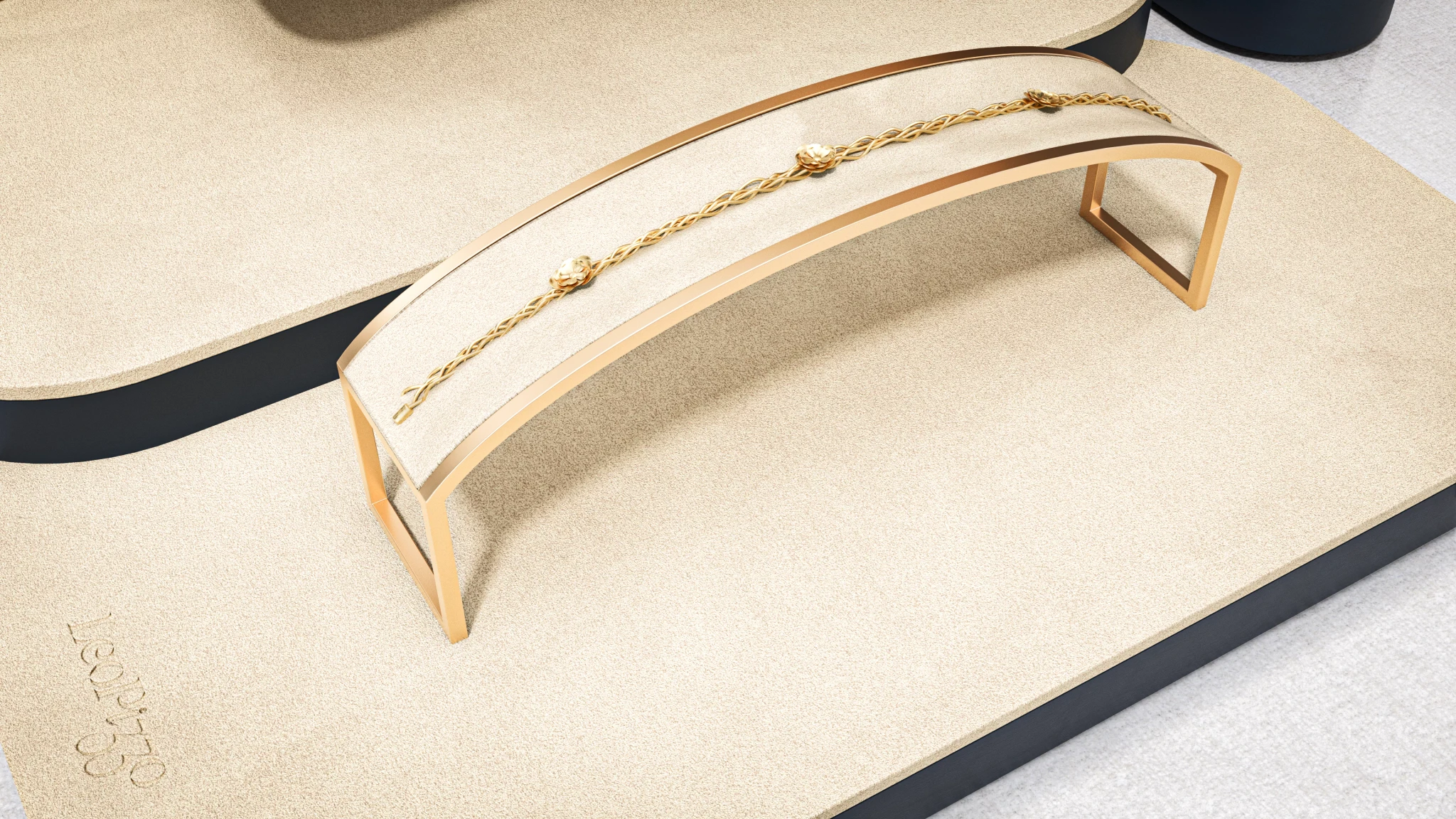
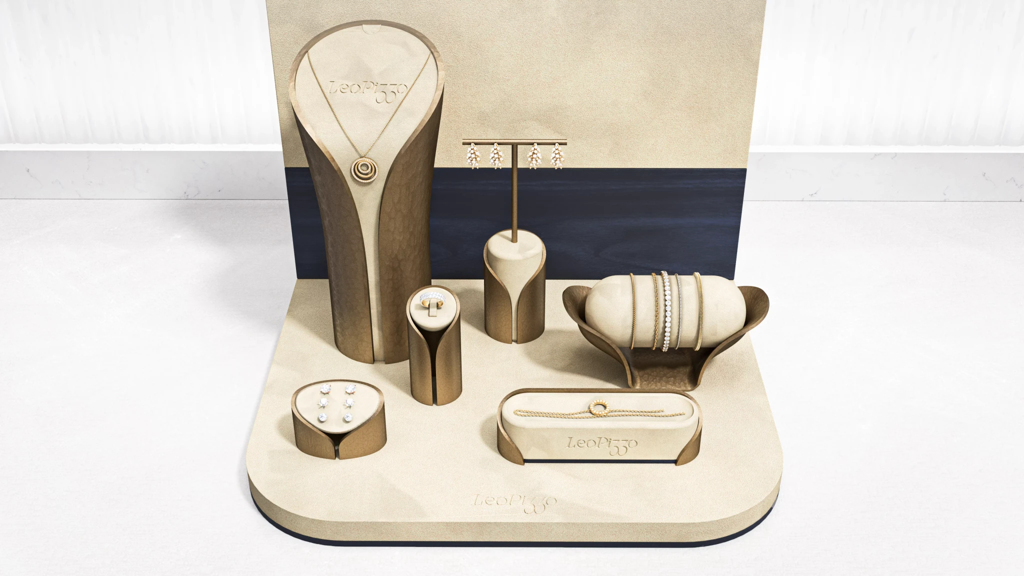
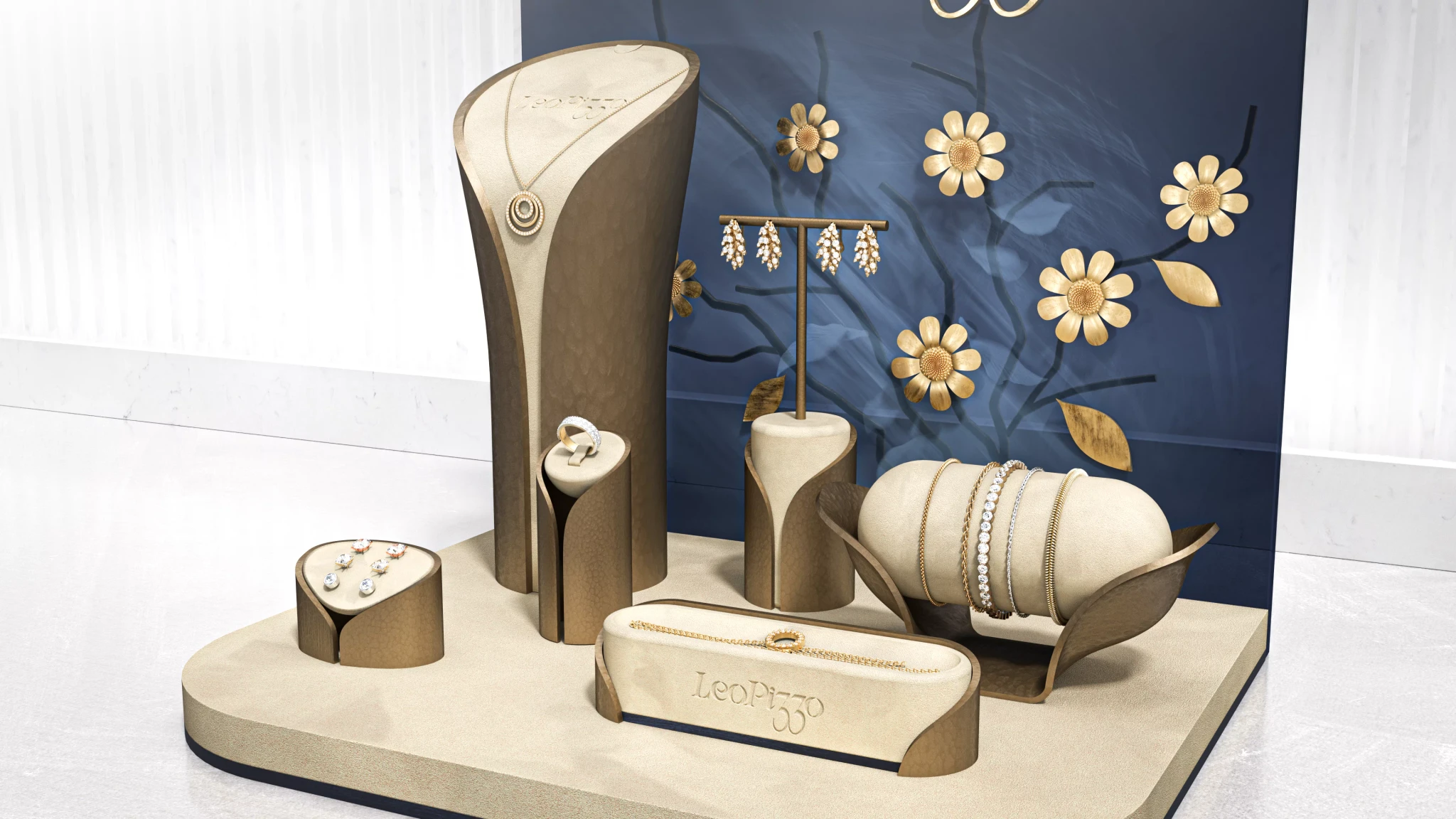
Cream coloured suede dominates the presentation surface with brass metal stands creating elevation.

The display size can be reduced by retracting two base plates. They sit flush with the main display:

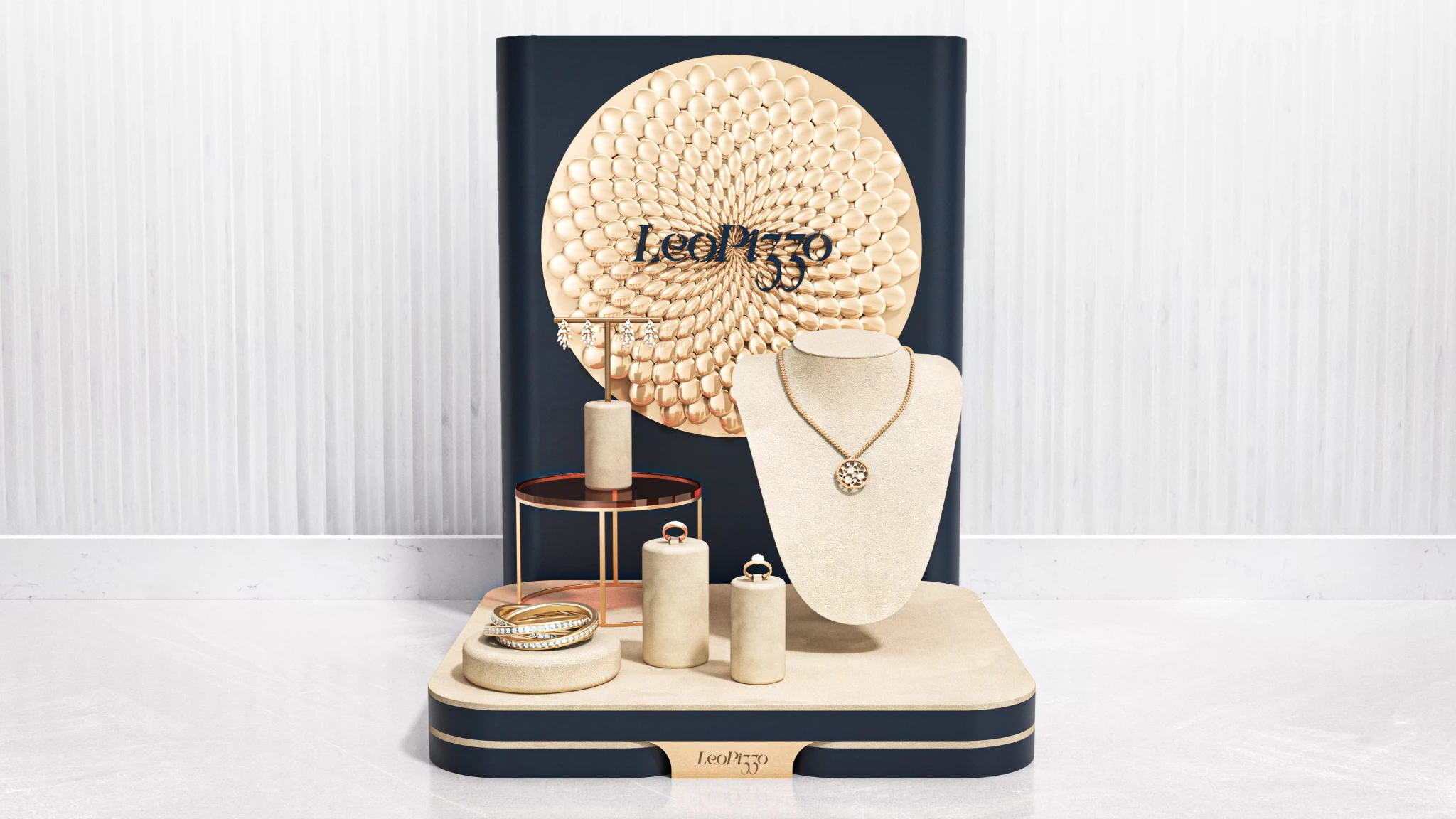
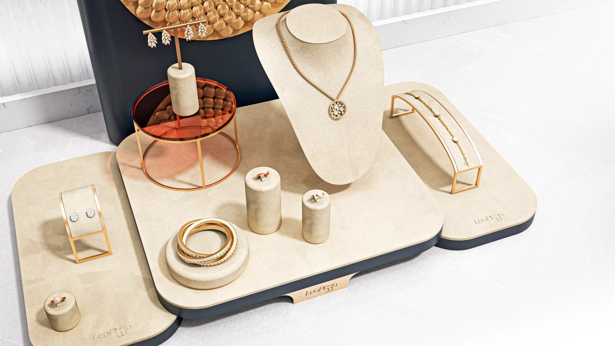
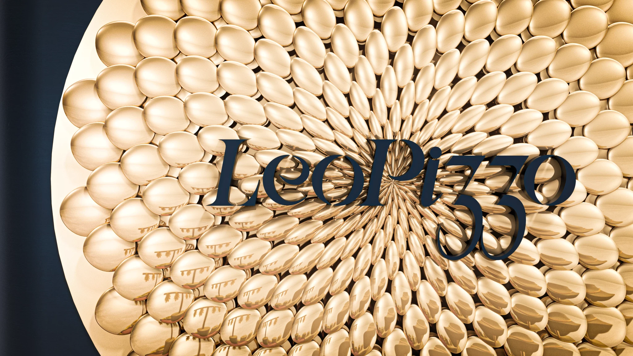
The flower pollen element was modelled parametrically in Grasshopper.

Design 2.1

In reference to the inspiration in nature Leo Pizzo draws from, this design is centered around plant husks & stems. These open up to reveal soft suede elements. The curves that inform the design follow the feminine shape, whilst the outer "husks" feature a subtle organic texture. The back wall presents the Leo Pizzo Logo in suede letters, with a dark blue veneered element below creating contrast between the jewelry presentation and background.

Design 2.2

This design features a tinted acryllic back plate with elements arranged on different layers. At the back, branches emerge. The acryllic glass features a print of leafs & subtle fog. In front, flowers adorn the acryllic. This interplay of elements creates a 3D effect that catches the viewers eye when in motion.

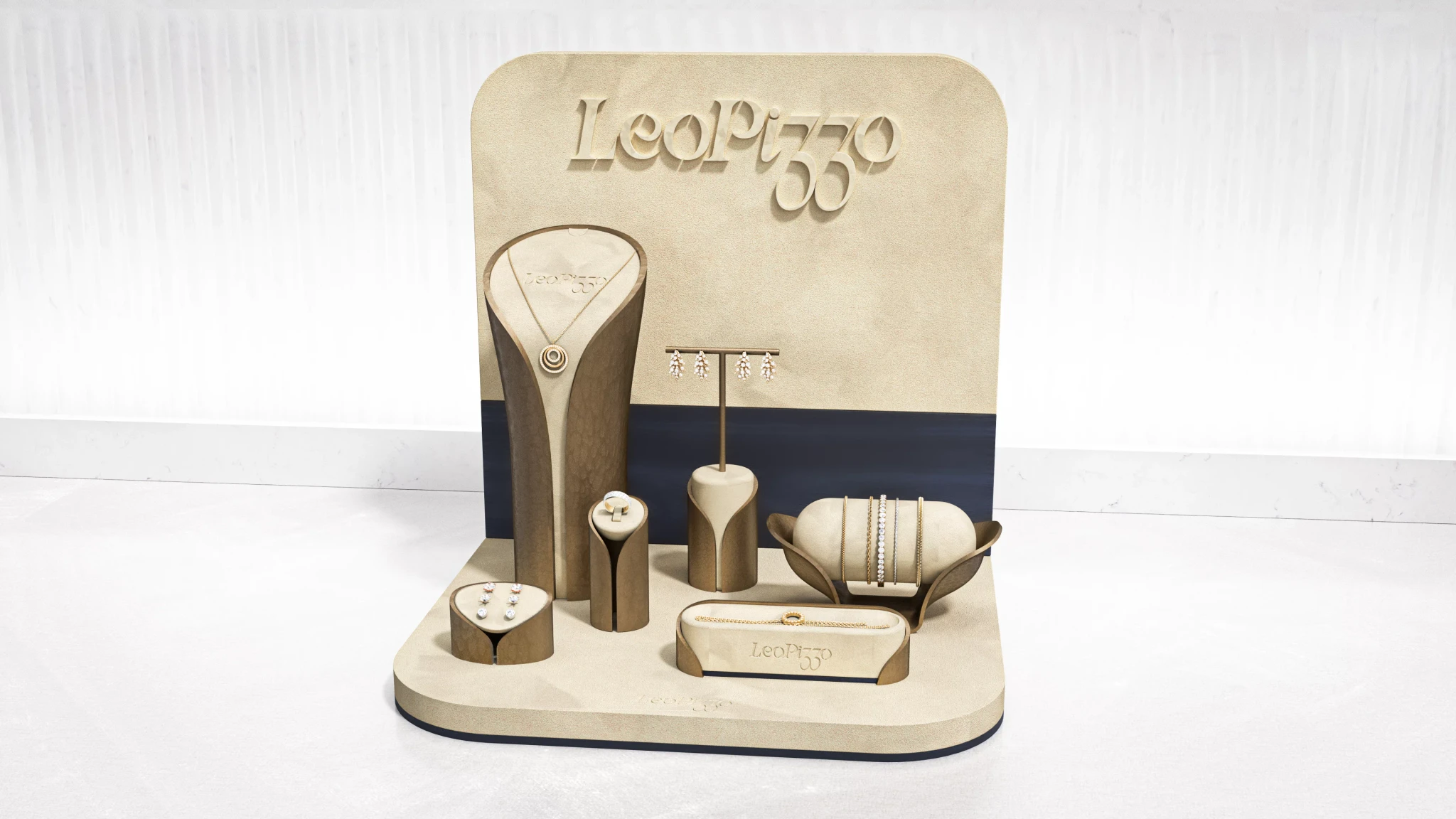
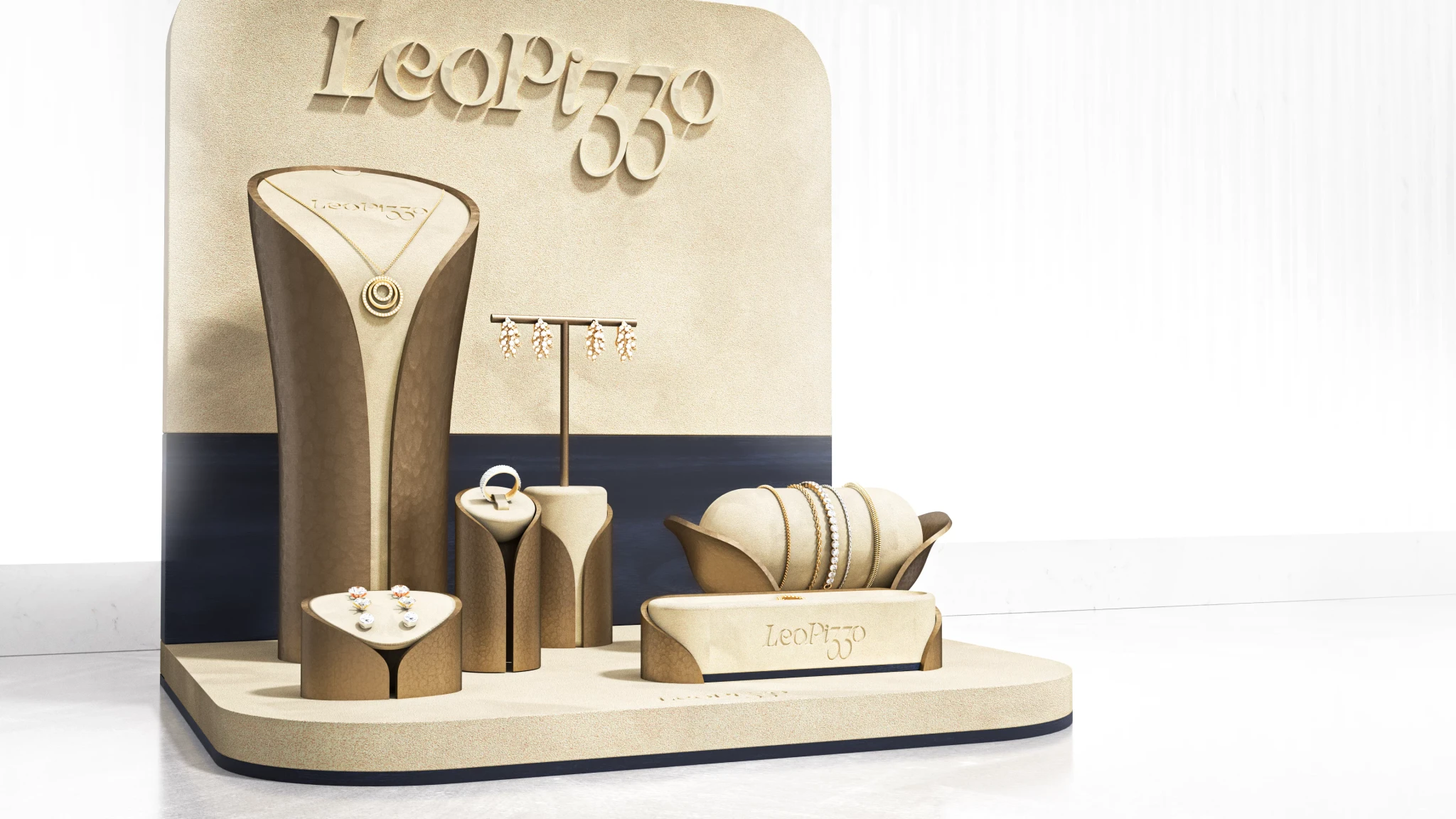
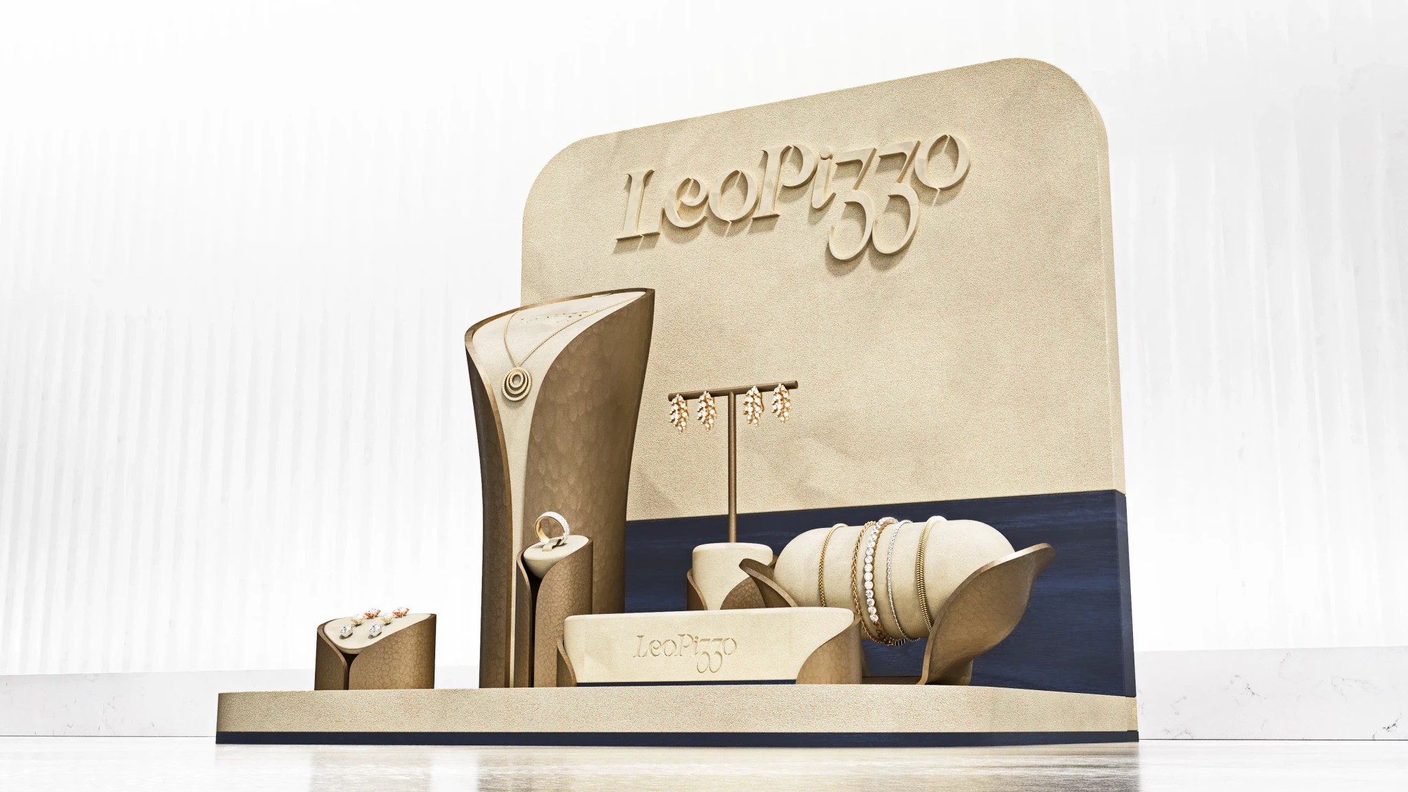
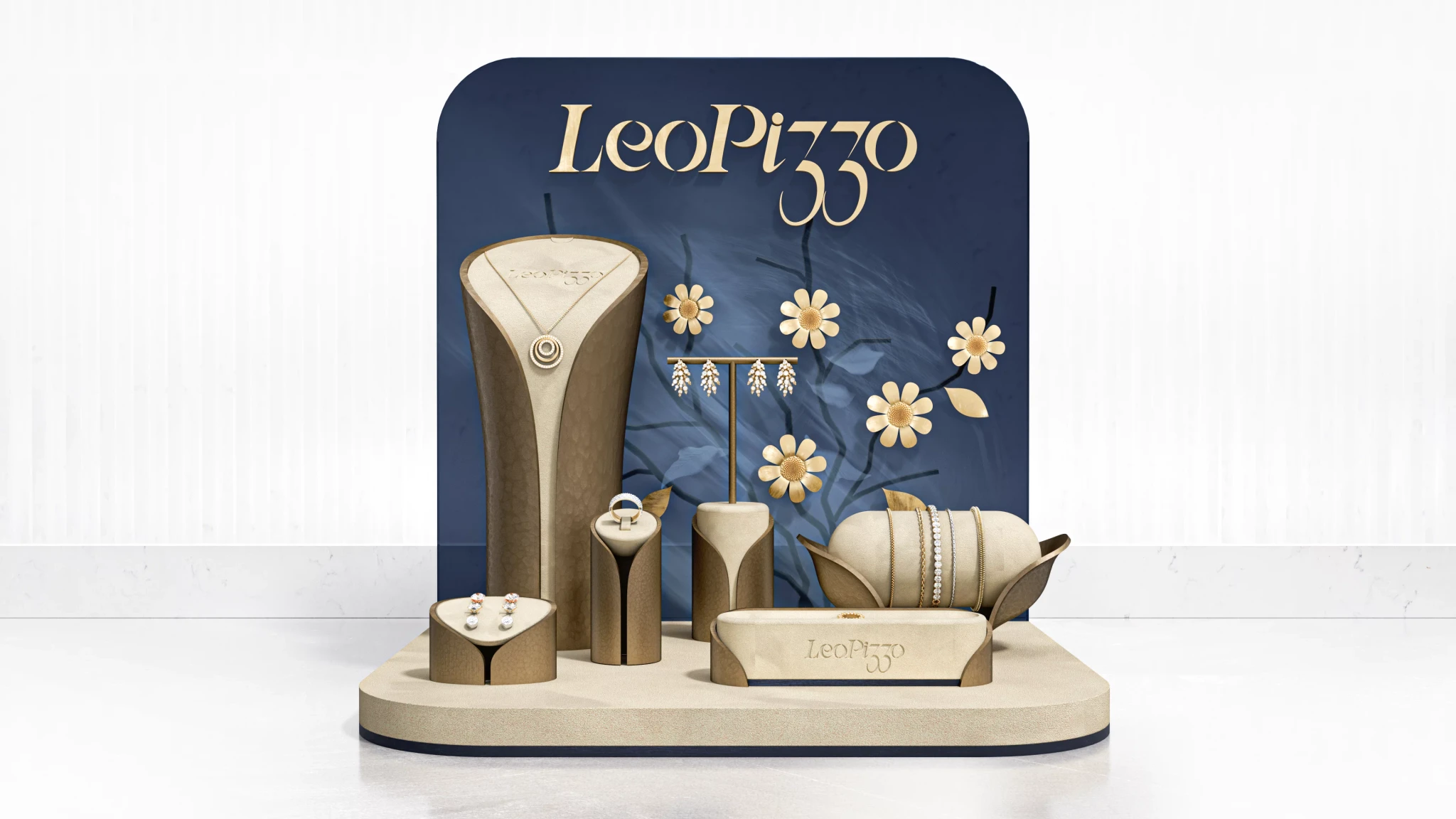
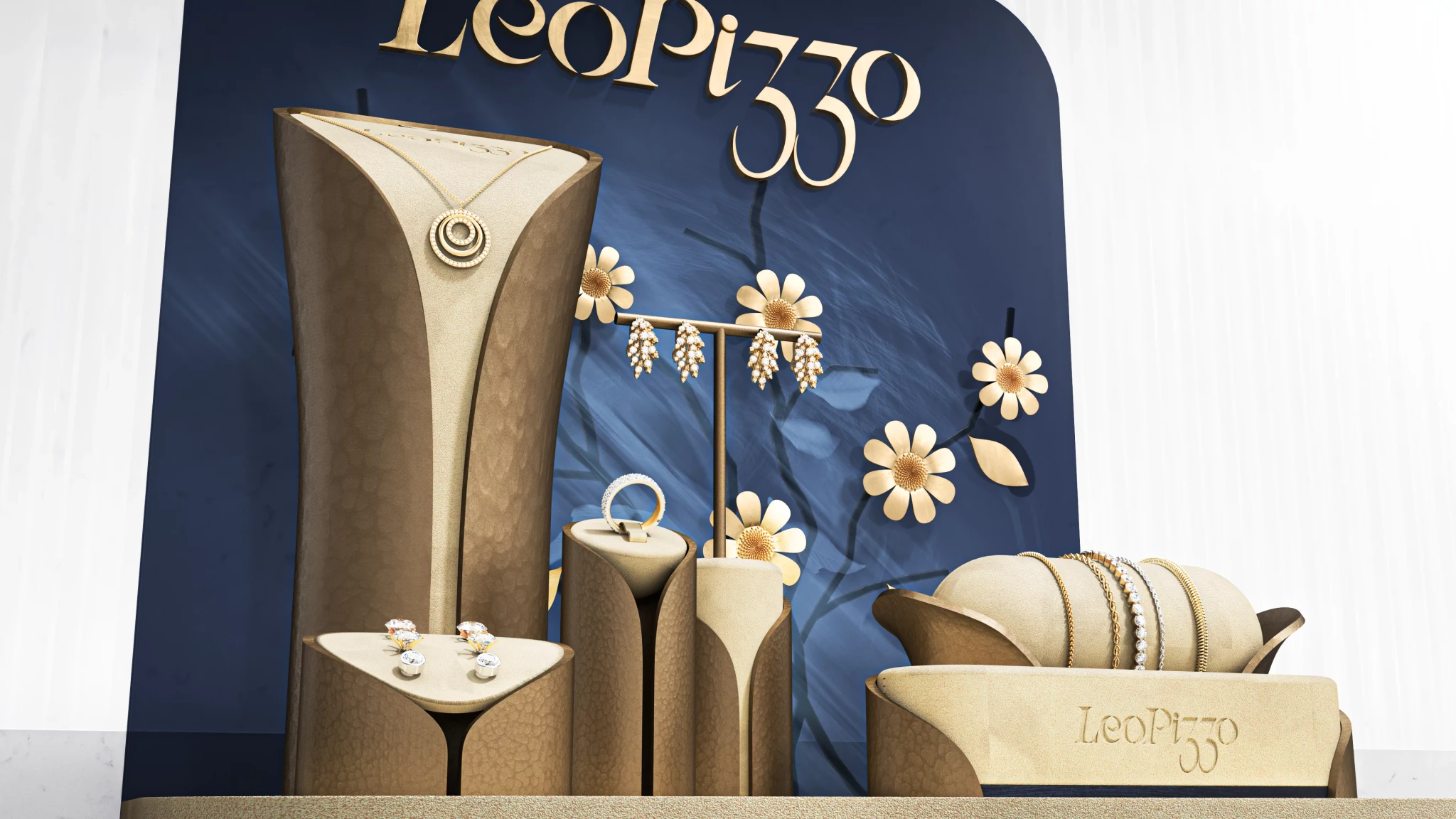
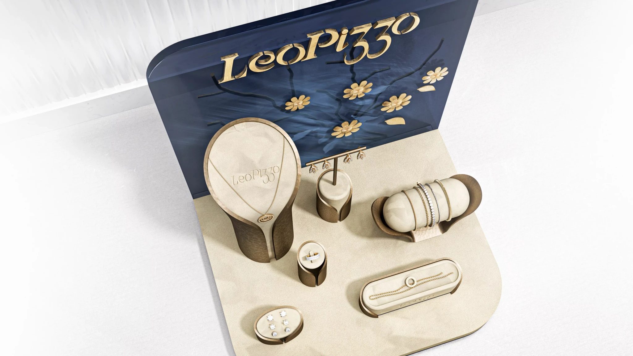
The Leo Pizzo logo in applied metal letters.

thoughts

The brand follows a strong design language, and designing to create the ideal stage for their high-end luxury jewelry pieces was an exciting challenge.

Many of the design skills that I focused on previously came into play for this project, from SubD to parametric modelling.

thank you for reading!

up next:

automatic wristwatch

Cognac Packaging Made in EU

Standard Watch Packaging Made in EU

thank you for reading!

up next:

automatic wristwatch

Cognac Packaging Made in EU

Standard Watch Packaging Made in EU

Designed by Philipp Schönfisch

Designed by Philipp Schönfisch